Tabs allow navigation between different sets of related content or can be used to navigate an entire application.

Anatomy

- Tab
- Active Tab Icon
- Active Tab Label
- Active Tab Indicator
- Inactive Tab Icon
- Inactive Tab Label
Text Label
Text labels should clearly and succinctly describe the content they represent. Tabs have a max-width of 250px by default, and long labels will wrap, but this obviously has a drastic impact on the presentation so we should take great care with the words we choose.
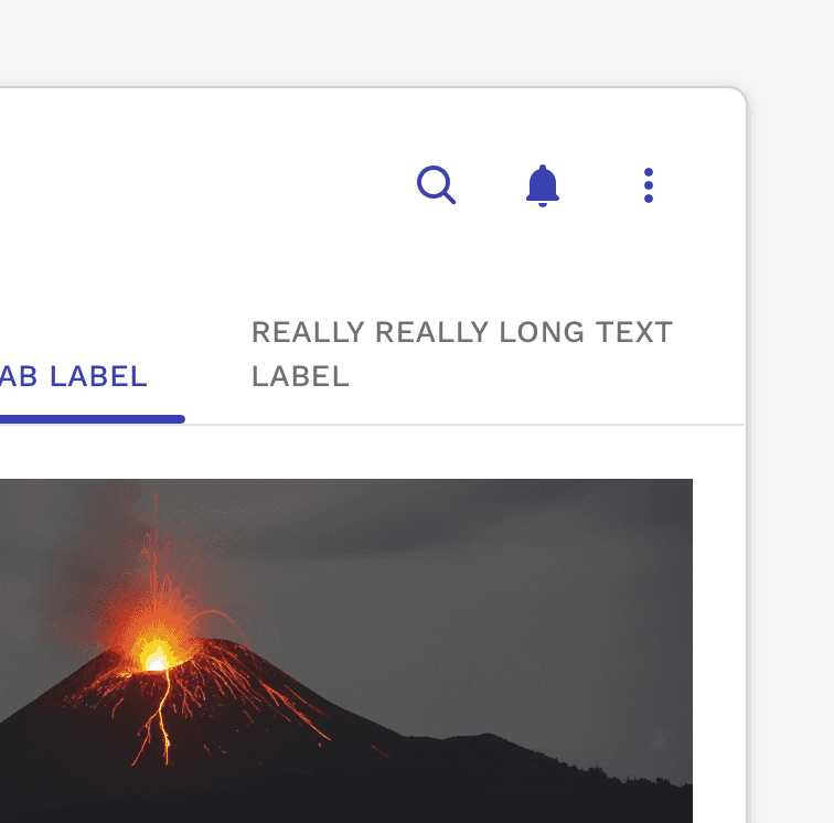
Caution
Be careful how much text you use in your tab labels. The text will wrap, but it has a drastic impact on the presentation of your tabs.
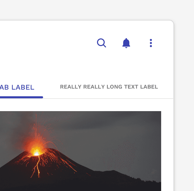
Incorrect
Do not resize the text on a tab to make it fit on a single line.

Incorrect
Do not truncate text on a tab to make it fit on a single line. This could make it difficult to understand the true intent of the tab.
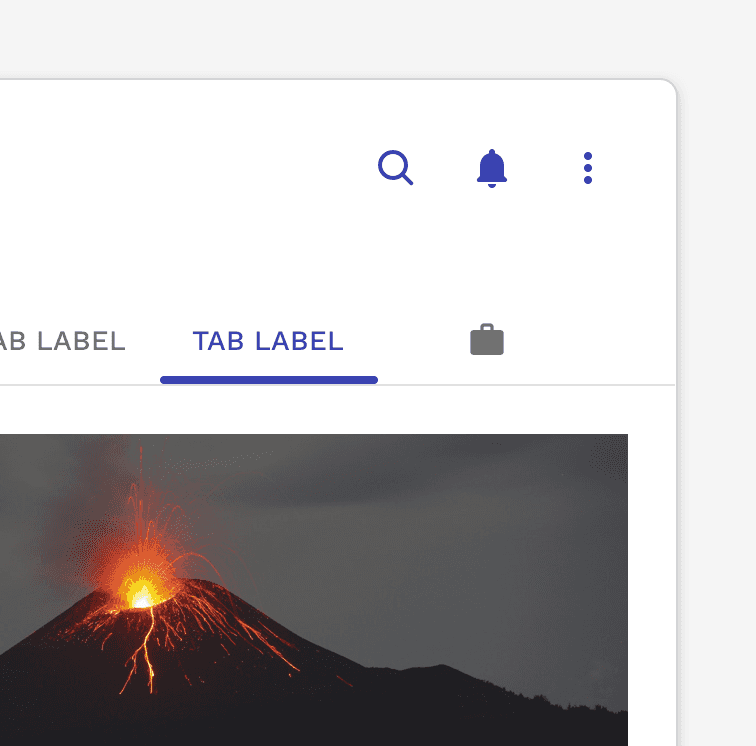
Incorrect
Do not mix icon-only tabs with text-only tabs. All tabs in a group should use the same type of tab consistently.
Icons
Icons can be very helpful in helping identify the type or context of the content the tabs represent.
Icon + Text Label
Icons can be placed to the left of the label or on top of the label, depending on the desired outcome or constraints of the layout. The added space required by the icon requires even greater effort to make the text label as short as possible.
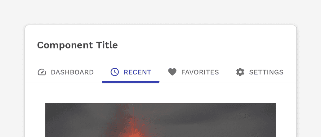
Icons and text labels can be used together to help communicate what the content is.
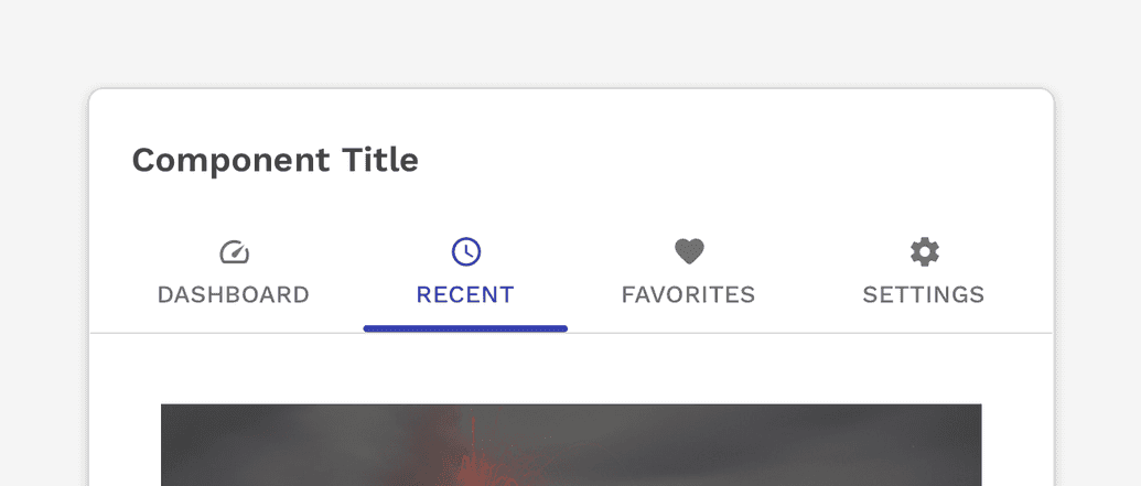
Icons can be stacked on top of the label which saves horizontal space, but also increases the vertical footprint.
Icon Only
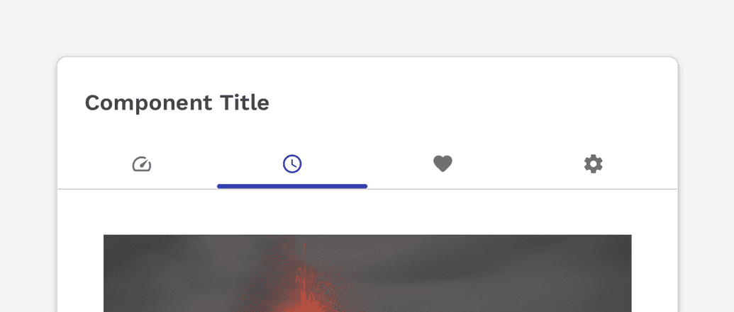
Icon-only tabs can be very useful for communicating the content they represent, especially in small areas or on small devices.
Caution
Icons used on their own should only be done if testing proves that the icons being used are clear and easy to understand or learn quickly.
Active Tab Indicator
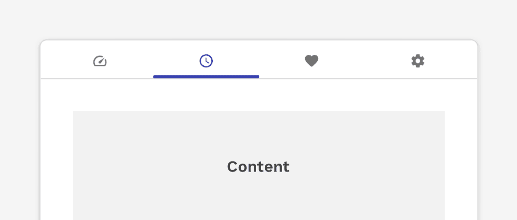
The active tab indicator helps make it very clear which tab is currently selected.
Correct
The indicator appears on the bottom of the tab by default.
Caution
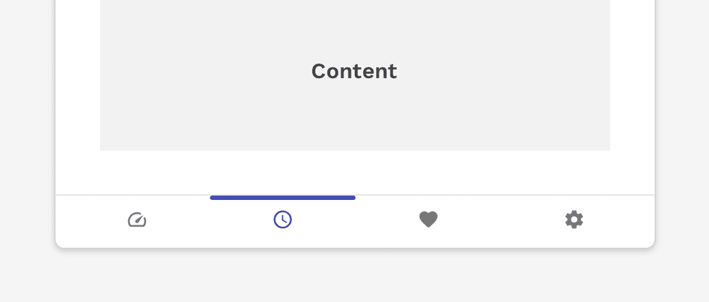
Displaying tabs below their associated content panel is most commonly used for navigation that appears at the bottom of the viewport on mobile devices. Using this same pattern for a simple set of tabbed content on a page could be unfamiliar and confusing to the user, and should not be used without proper user-testing.
States
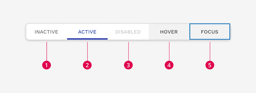
- Inactive
- Active
- Disabled
- Hover
- Focus
Placement
Tabs are displayed in a single row or column, with each tab connected to the content they represent. Tabs can be attached to headers, main content areas, side panels, and nestled into cards.

Example of tabs in the header of a panel.
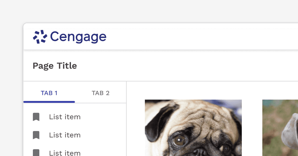
Example of tabs in a column.

Incorrect
Don't nest tabs to create multiple levels.
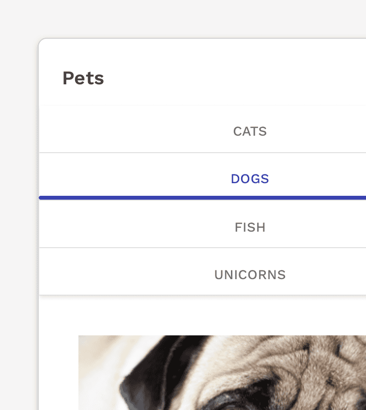
Incorrect
Don't stack tabs meant to be horizontal on top of each other.
Tab Layout
Auto-Width Tabs
The default width of a tab is undefined and is determined by the content within the tab plus 20px of padding on either side. There is, however, a max-width of 250px which could cause the text within a tab to wrap to multiple lines.
Alignment
Auto-width tabs can be left-aligned, right-aligned, or centered.
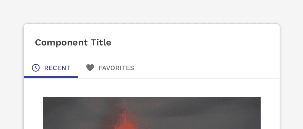
By default, auto-width tabs are left aligned.
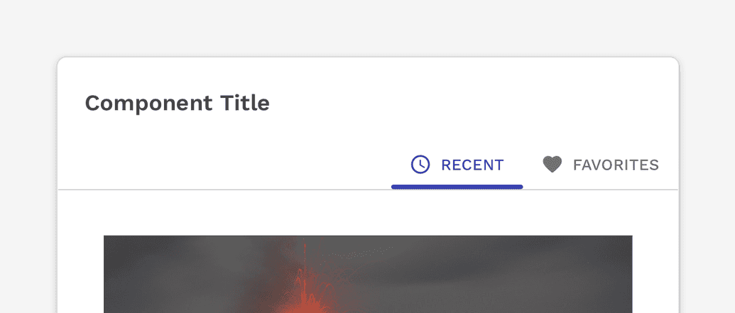
You may also right-align the tabs with the content below or above.
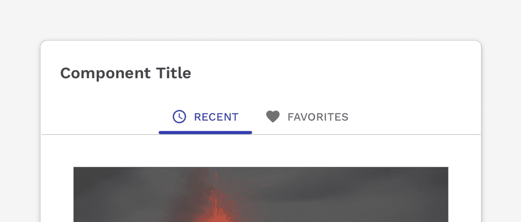
On wider layouts, centering the tabs may work well.
Scrolling Horizontal Tabs
The tab container for auto-width tabs will automatically scroll if the container becomes too small to show all the tabs. Buttons to scroll left and right will automatically be added, but users with touch-based devices will also be able to drag the tab container left and right.
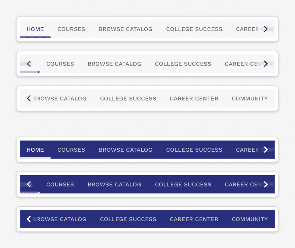
If there are more tabs to see beyond the edge of the container, you will see an arrow appear at the right side of the tabs container.
Full-Width Tabs
Full-width tabs can be calculated by the width of the container divided by the number of tabs. Full-width tabs should only be used if you can guarantee that all tabs will be visible without truncation regardless of the size of the container.

Simple example of full-width tabs, each tab being of equal width.

Caution
Be careful with how the content aligns with the tabs themselves. In this example, the alignment could cause users to misunderstand what the tabs represent.
Vertical Tabs
Tabs may also be placed to the left of their corresponding content in a vertical layout.
NOTE: There isn’t any default Responsive behavior for when the content area gets too narrow to display the tabs next to the content. You are encouraged to reuse solutions from other instances of vertical tabs. In the event no solution exists that will work in your scenario, a new solution will have to be designed.
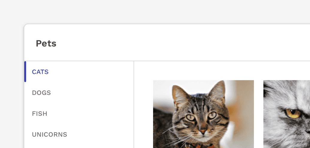
Simple example of vertical tabs on the left side of the content.
Scrolling Vertical Tabs
Vertical tabs will also automatically scroll when the height of their container is too small to display all of the tabs.

If there are more tabs to see beyond the bottom of the container, you will see an arrow appear at the bottom of the tabs container.
Inverse Styling
The tabs have inverse styling available for use on dark backgrounds. Take care with the color you choose for the background to make sure the necessary contrast ratios are upheld for accessibility compliance.

Example of tabs on a dark blue background.
On this page