Tables are used to organize and display data efficiently. The table component allows for customization with additional functionality, as needed by your product’s users.
Usage
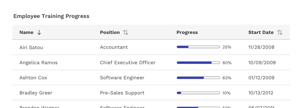
Tables display information in a grid-like format of rows and columns. They organize information in a way that’s easy to scan so that users can look for patterns and develop insights from data.
Tables can contain:
- Interactive components (such as inputs, buttons, or menus)
- Non-interactive elements (such as badges)
- Tools to query and manipulate data
When to use
- To organize and display data.
- If your user must navigate to a specific piece of data to complete a task.
When not to use
- When a more complex display of the data or interactions are required.
- As a replacement for a spreadsheet application.
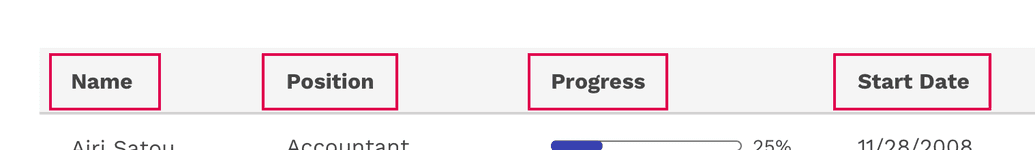
Anatomy
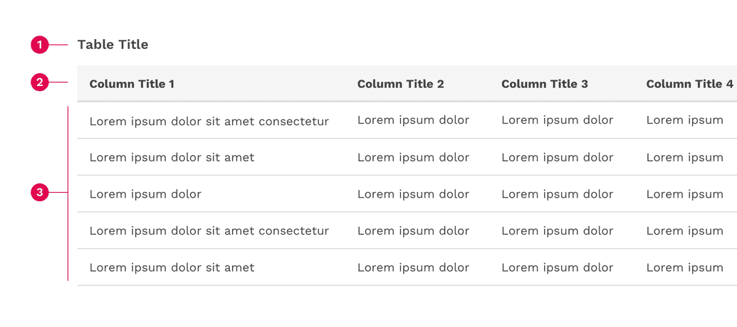
- Table title
- Table header
- Table rows
Sizing
Tables come in three different sizes or densities: compact, normal, and loose. This is applied to the entire table and not just a specific row or cell.
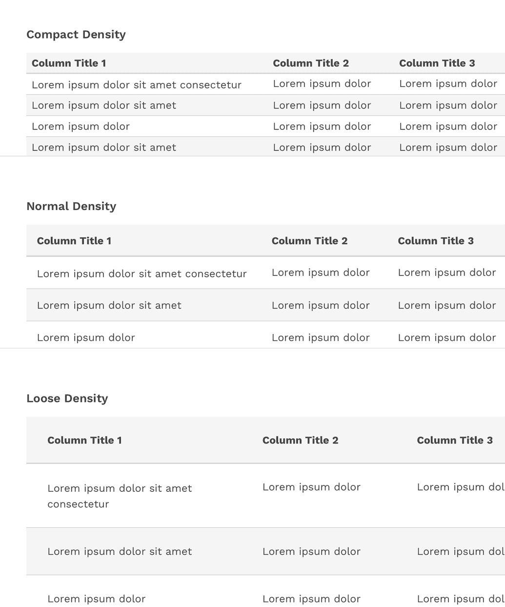
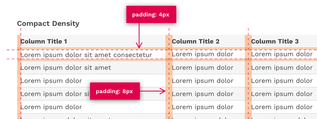
Compact Density
The compact density can be useful for tables with a relatively large number of columns and rows by allowing you to simply fit more on the screen at once.
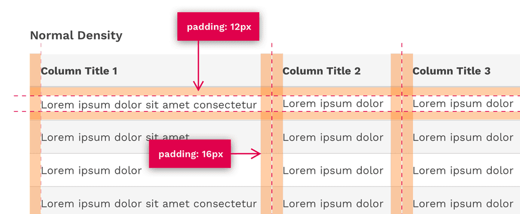
Normal Density
The default padding of tables is optimized for a nice balance between compact and loose densities.
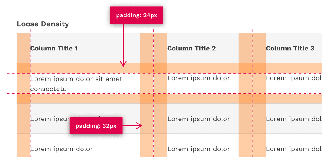
Loose Density
The loose density can be useful if you have a relatively small amount of data and if the user would benefit from the table having more white-space within it.
Content
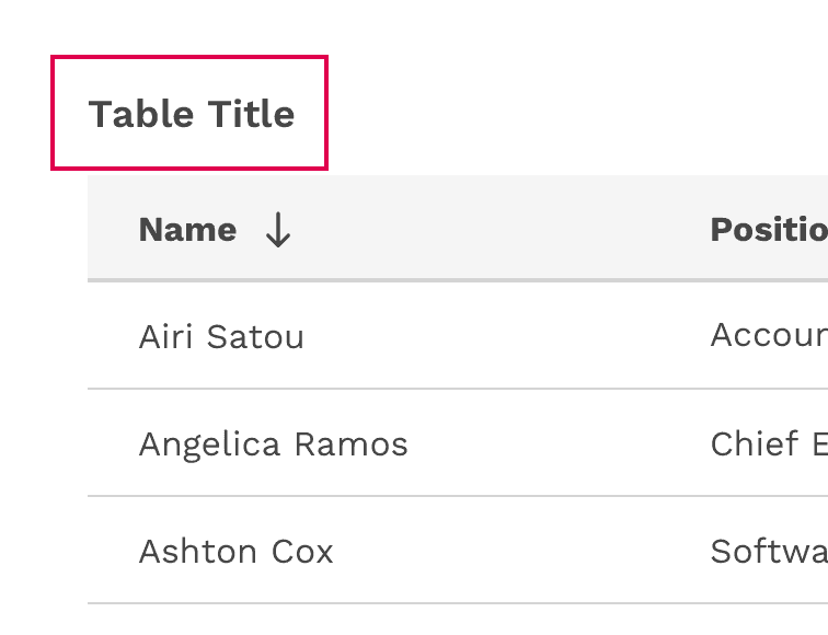
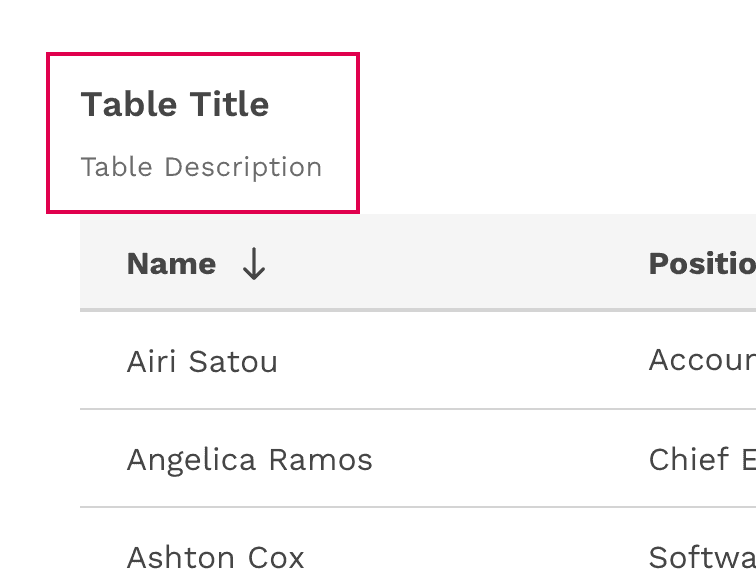
Table Title and Description
- The table title should make it clear to the user what the data is and what purpose it serves in the UI.
- A description can be added under the title to provide more information about the data or its source.
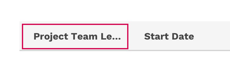
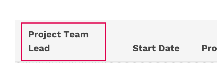
Column Titles
- Column titles should stick to one or two words that describe the data in that column.
- In cases where a column title is too long, the text will wrap to two lines.
Incorrect
Don't truncate column titles.
Correct
Let long column titles wrap naturally.
Table Cells
- Table cells can contain just about any kind of content: Text, numbers, images, buttons, inputs, and more.
- The content within a cell should be left or right aligned. Using center-alignment could make it difficult for a user to scan the column of data.
- Columns of numbers should typically be right-aligned for better scanning.
Behavior
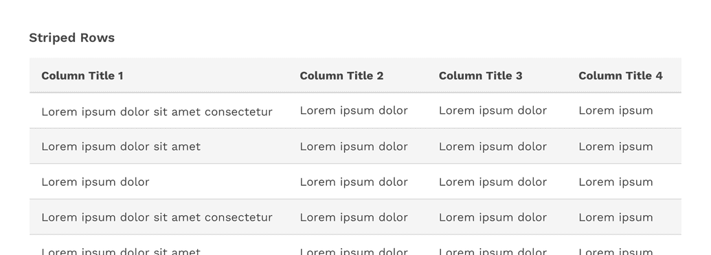
Striped Rows
Striped rows (zebra striping) is an optional styling you may apply to your table. This can make data-heavy tables easier for your user to read, as the stripes help guide the eye across the table and then back to the next row.
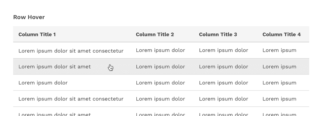
Hover
The table’s row hover state can help your user visually scan the columns of data in a row even if the row is not interactive. This feature is optional and is easily enabled for any table, and may be used in combination with striped rows.
Sorting
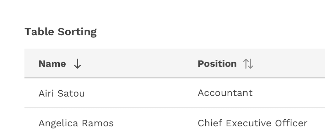
Columns can be sorted in ascending or descending order. Sorting controls are located in the column headers and indicated with an arrow icon to the right of the label.
A sorted table has three states: unsorted (sort-double-arrow), sorted-up (arrow-upward) or sorted-down (arrow-downward). The icon indicates the current sorted state. All sortable columns display an arrow icon, but only one can be actively sorted at a time.
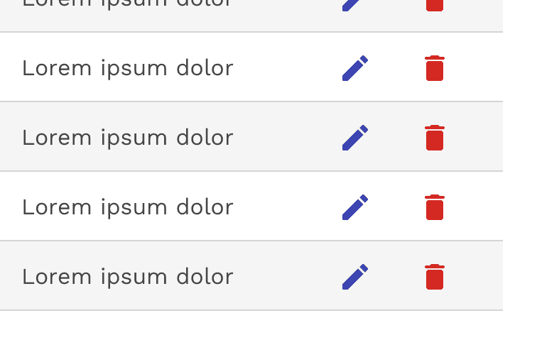
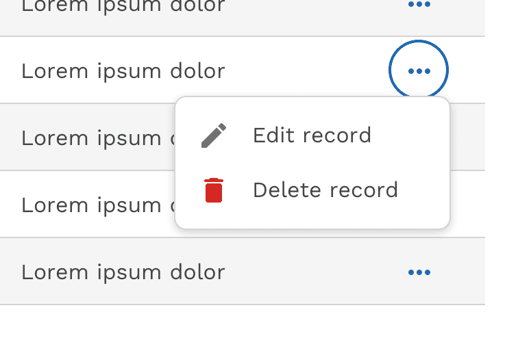
Inline Actions
Inline actions are functions that may be performed on a specific table row. In order to save space, inline actions can be condensed under a single overflow menu.
On this page