The Radio button allows the user to select one option from a set.
Usage
Use radio buttons when the user needs to see all available options. If available options can be collapsed, consider using a Select component because it uses less space.
Radio buttons should have the most commonly used option selected by default.
Radio buttons
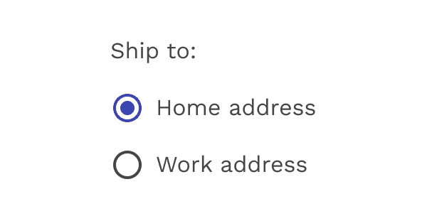
Correct
Use radio buttons when only one item can be selected from a list.
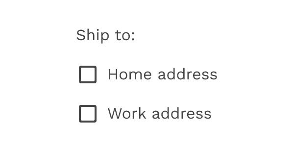
Incorrect
Don’t use checkboxes when only one item can be selected from a list. Use radio buttons instead.
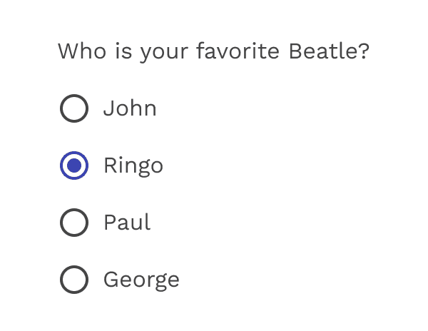
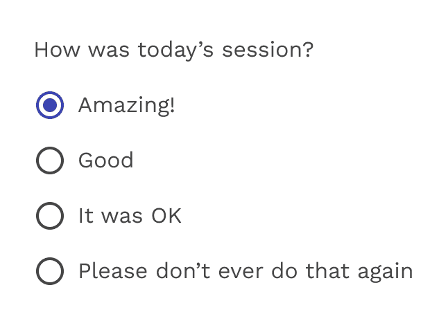
Radio buttons - only one option can be selected at a time.
States
Radio buttons can be off or on. Radio buttons have enabled, focused and pressed states.
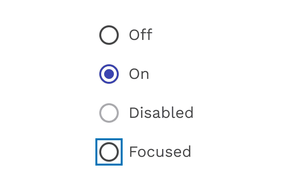
Radio states
Inverse
Use the inverse version when using the radio buttons on a dark background.
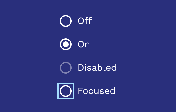
Inverse colors
On this page