The platform header component is intended to showcase the platform/product logo and can include icons, text links, inputs, and other features that are persistent throughout the experience.
Usage
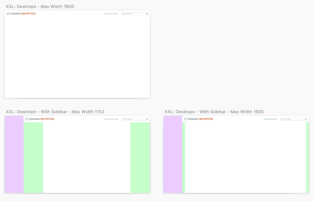
The header can be implemented with or without the Cengage Unlimited sidebar and is available in two vertical sizes (standard and compact) and both light and dark (inverse) styles.

Anatomy
The header component is designed to be extremely flexible allowing designers to incorporate the features they need while maintaining consistency across platforms.
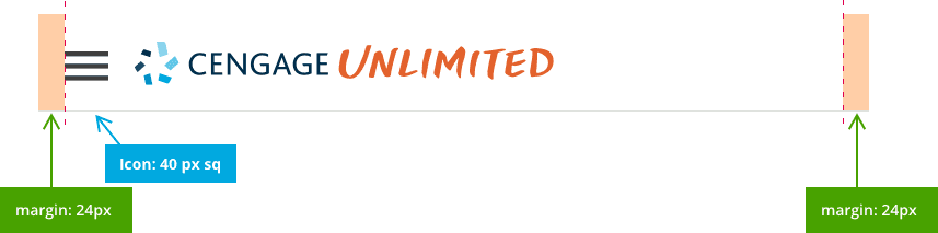
- Platform/corporate logo
- Icons, text links, primary navigation, inputs, etc.
- Bottom border
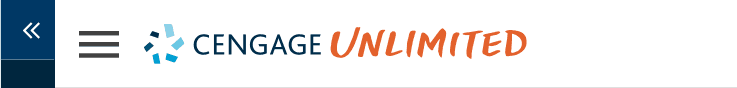
- Hamburger menu for responsive design


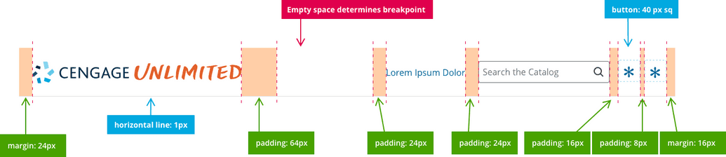
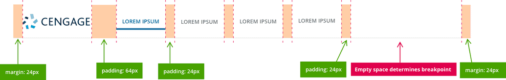
Horizontal Specifications
Horizontal specifications are consistent across all “flavors” of the header (standard, compact, and responsive.)
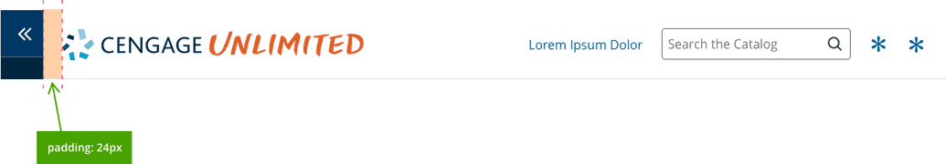
Left Justification
In certain circumstances, designers may need to left-justify header features. The component allows for this and uses the same basic rules of horizontal and vertical spacing.
Span Width
The header should span the full width of the screen. On extra wide displays, the content may include expanded margins on each side, but the header logo should remain left-justfied to the edge of the screen, and (in most cases) the icons, features and inputs should remain right-justfied to the edge of the screen.
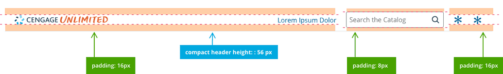
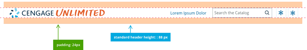
Vertical Specifications
Vertical specifications vary between the standard and compact views.
Icons, Inputs, and Features
Be careful not to use icons in the header that would be better-served elsewhere in the experience. Right-justified icons should only be used to highlight important, but ancillary features to the primary UX. Designers, ask yourself the following questions:
- Is this feature highly important, but secondary to the user’s needs?
- Is the feature “global” to the platform? (Does the user need access from every screen?)
- Is the feature better-suited for the sidebar?
- Would the feature be better-served as a navigation item in the sidebar or inline with the content?
- Do the right-aligned header features provide balance to the visual experience?
Order Of Operations for Icons
(Recommended but not required)
In order to maintain consistency across platforms, icons and features should be implemented as needed in the following order (from right to left):
- Profile or Username
- Help and Support
- Notifications
- Settings
- Misc. Icon Features
- Search
- Text link (Call to Action)
Considerations
Here are several examples of strategies that designers should avoid:
Don't use too many icons
Incorrect
Incorrect: Too many icons create inbalance and clutter
Don't duplicate items
Don't duplicate items that already exist in the sidebar or elsewhere on the UI.

Incorrect
These already exist in the sidebar or are better suited there
Don't use a collapsed sidebar and hamburger menu
Incorrect
Sidebar controls should never co-exist with the hamburger menu
On this page