A checkbox is an input control that allows a user to select one or more options from a number of choices.
Usage
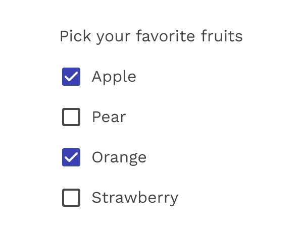
Use checkboxes to:
- Select one or multiple items from a list
- Present a list containing sub-selections
- Turn an option/setting on or off
Checkboxes
Parent and Child Checkboxes
Checkboxes can have a parent-child relationship with other checkboxes.
- When the parent checkbox is checked, all child checkboxes are checked
- If a parent checkbox is unchecked, all child checkboxes are unchecked
- If some, but not all, child checkboxes are checked, the parent checkbox becomes an indeterminate checkbox
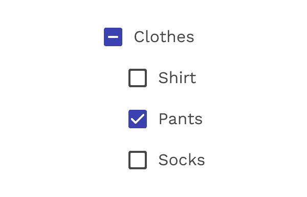
Parent-child relationship for checkboxes
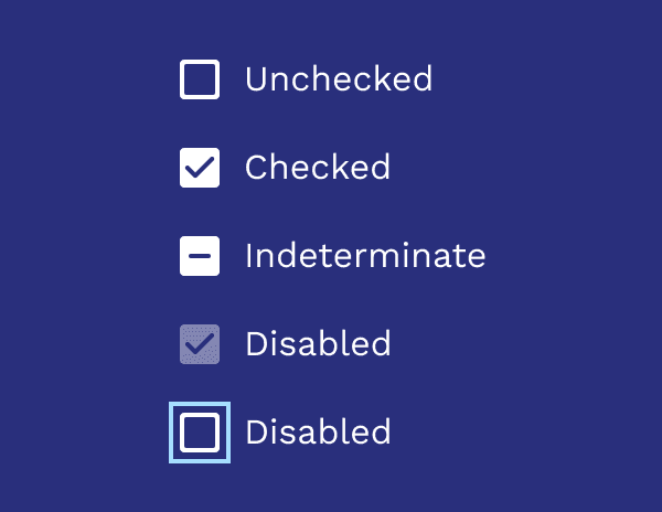
States
Checkboxes can be selected, unselected, or indeterminate. Checkboxes have enabled, disabled, focused and pressed states.
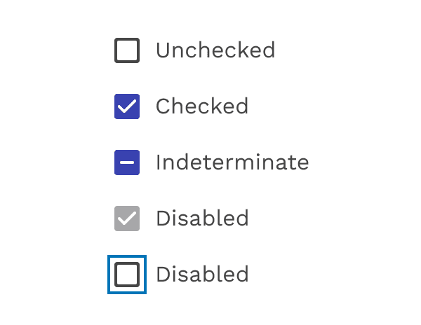
Checkbox states
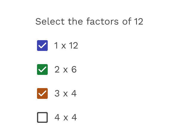
Colors
The default color used for checked checkboxes is primary-500 from the Magma palette, but sometimes a special scenario or specific UI can benefit from using one of the other colors from the palette. Colors like Info Blue (info-500), Success Green (success-500), or Danger Red (danger-500) can help add context when used responsibly and consistently.
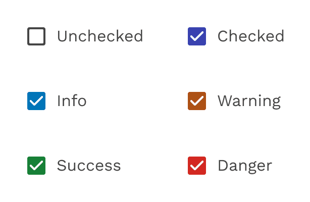
Alternate colors
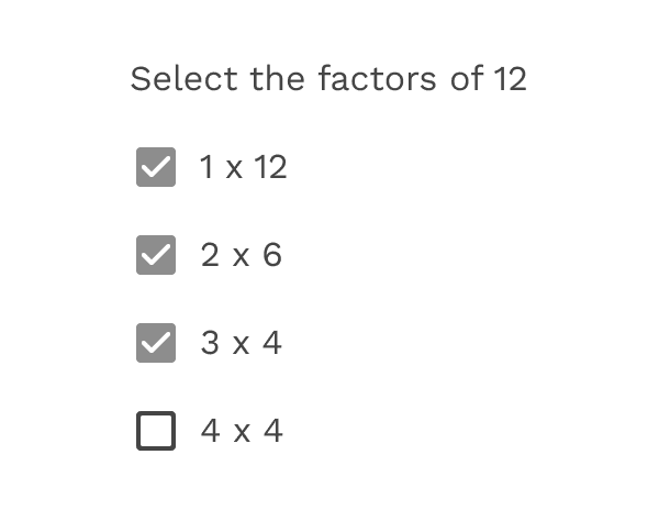
Incorrect
Do not use multiple colors in the same UI. Pick one and stick with it.
Incorrect
If you are going to change the color, don't use a neutral color. This could be confused with a checkbox that is checked and disabled.
Inverse
Use the inverse version when using the checkboxes on a dark background.
Inverse colors
On this page