Buttons are clickable items used to perform an action.
Usage
Buttons communicate actions that users can take.
- Submit a form.
- Begin a new task.
- Trigger a new UI element to appear on the page.
- Specify a new or next step in a process.
Types
Text Button (low emphasis)
Text buttons are typically used for less important actions.
Outlined Button (medium emphasis)
Outlined buttons are used for more emphasis than text buttons due to the stroke.
Solid Button (high emphasis)
Solid buttons have more emphasis, as they use use a color fill.
Anatomy
Text Label
Almost all buttons use text labels, which describe the action that will occur if a user taps a button.
All Caps or Title Case?
By default Magma uses all caps text labels. This is to provide a greater contrast between buttons and surrounding text, therefore making buttons easier to find. This is especially helpful for buttons that don't have a visible container.
Text labels should always be short and have clear purpose. If a button requires a text label with three or more words, try really hard to shorten it. If you can’t, you may use title case to help reduce the size of the button’s footprint. We recommend buttons using title case also have an outline or solid container, to help differentiate the button from the text around it.
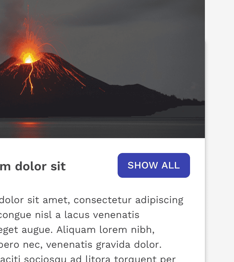
Correct
Keep labels short
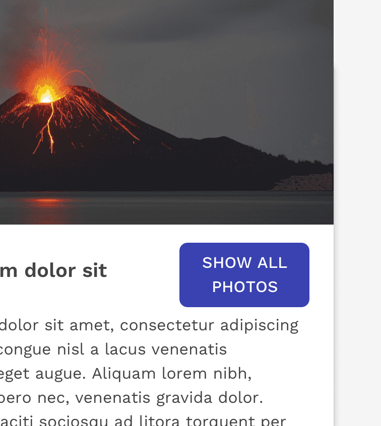
Incorrect
Don’t wrap text. For maximum legibility and recognition as a button, a text label should never wrap to multiple lines.
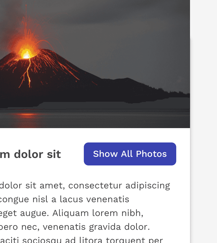
Correct
Text labels can be written in title case if all efforts to make the label less than three words have been exhausted, or if the button simply won't fit in the space without making it smaller.
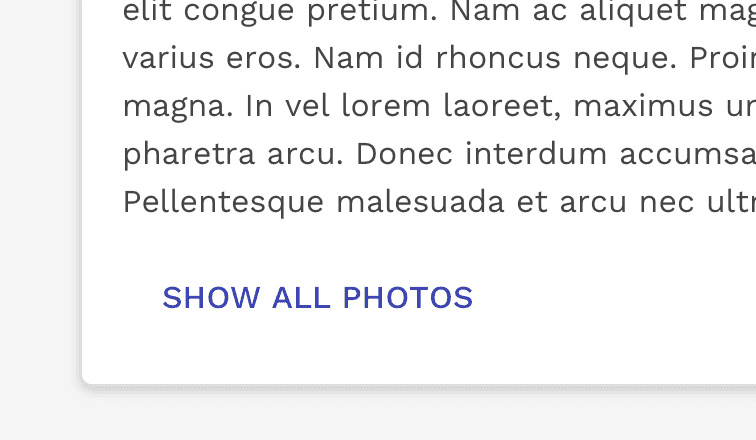
Correct
Text buttons don’t typically need a container when in all caps, because the label is differentiated from the text around it.
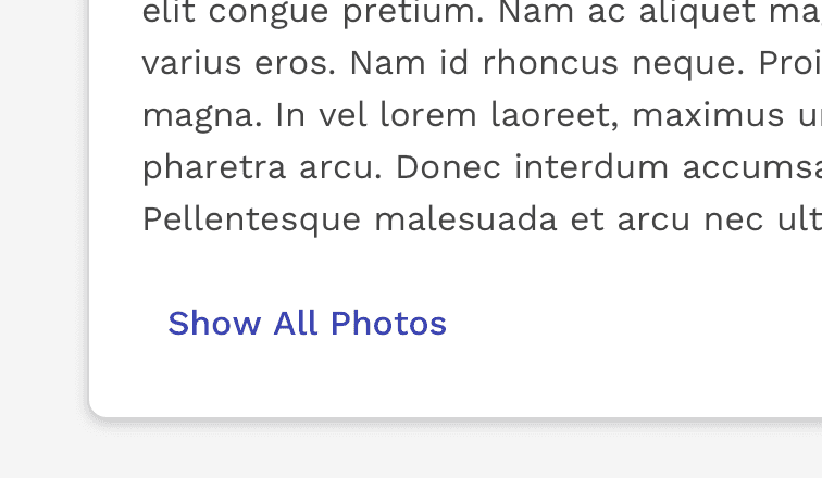
Caution
Text labels need to be distinct from other elements. Without a container, the button above could be hard to distinguish from the content above it.
Icon
You can place icons next to text labels to both clarify an action and call attention to a button. If a text label is not used, make sure the icon is intuitive and clear through testing. Also, consider using a tooltip so its exact meaning can be easily seen on hover.
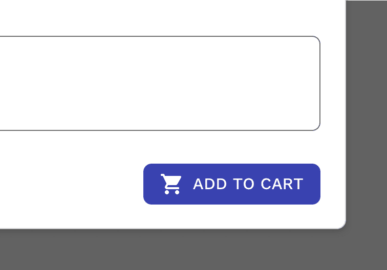
Correct
Use icons that clearly communicate their meaning.
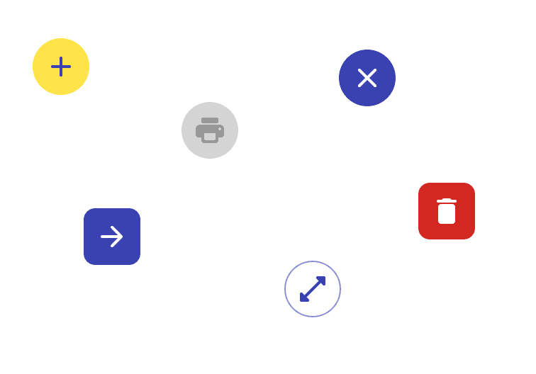
Correct
You can use icons without a text label if testing proves that the intended action of the button is clear to the users.
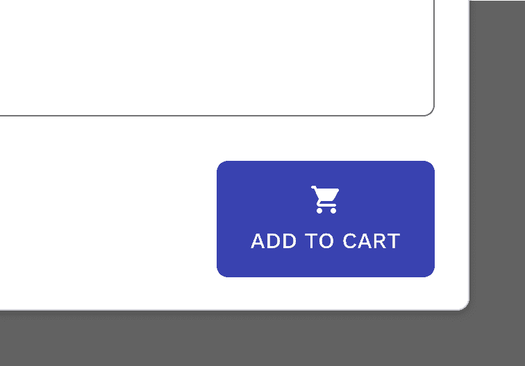
Incorrect
Don’t vertically align an icon and text in the center of a contained button.
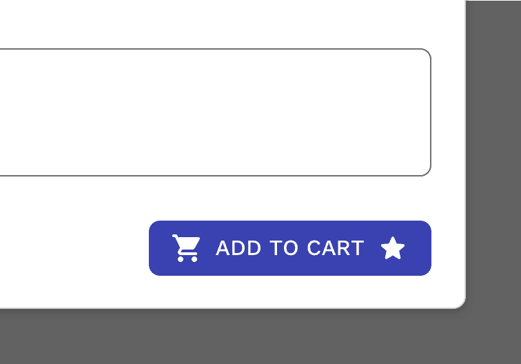
Incorrect
Don’t use two icons in the same button.
Sizes
Other than the standard sized buttons, there are two other sizes – Large and small.

Large buttons can be used in scenarios where space allows and you desire a much more prominent call to action.
Small buttons can be used in scenarios where you want less emphasis on some actions because there are other more prominent actions on the UI. They can also be used when space is limited for the number of buttons you need.
Minimum Width - Buttons with extremely short labels like “OK” or “Save” are in danger of being very small, even though they may be the primary action. To avoid this, all text buttons have a minimum of width of 5.625em (90px). This does not apply to icon only buttons.
Button Colors
Color can help reinforce the type of action that a button will perform if tapped. The default colors of the buttons are carefully chosen to both fit Cengage branding guidelines, as well as meet the accessibility requirement for color contrast ratio. If deviations to these colors are required, then you assume responsibility to meet accessibility requirements.
Primary and Secondary Buttons
The primary button should be used by default for important actions. From there you can use secondary or buttons without a container for other actions, because they less emphasis than primary buttons.
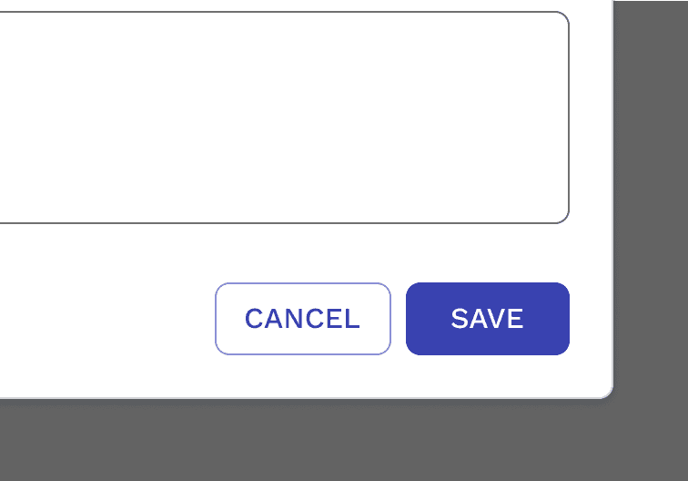
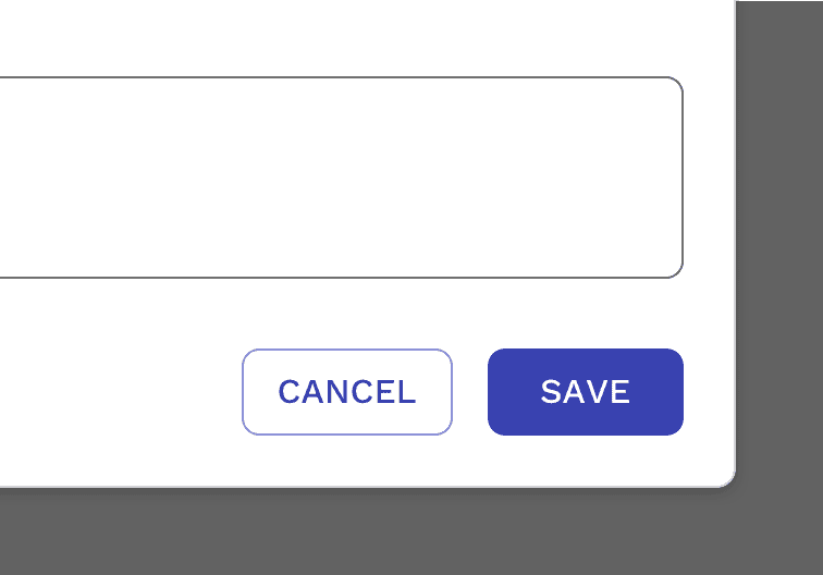
When you are pairing together primary and secondary actions such as "Save" and "Cancel", it is recommended you use the primary and secondary buttons.
Subtle Button
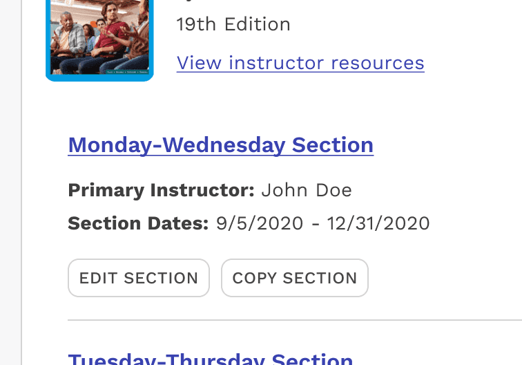
The subtle button style is intended to have even less emphasis than secondary. For this reason, it is recommended for ancillary actions that need to be seen as clearly actionable, but don't draw attention away from the primary and secondary actions on the page.
An additional benefit of the subtle button's very neutral appearance is to help limit the amount of the primary brand color appearing on the page. Too much of this color can result in a very chaotic experience where everything looks relatively important and is distracting. The subtle button helps calm an interface that has a high number of actions that can be performed.
Danger Button
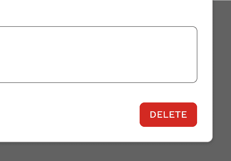
For actions that delete things, you can emphasize this action with the danger buttons.
Marketing Button
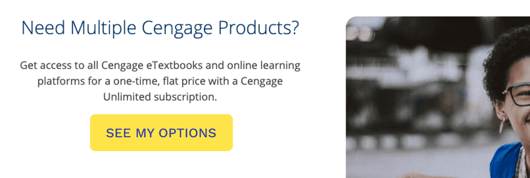
The marketing button is intended to be used on product websites where the primary purpose is to market and sell our products. The button is meant to be loud and draw as much attention to it as possible. For this reason, it is not recommended for use within the platforms and applications where our customers are trying to complete relatively complex actions. We want these experiences to instill a sense of order and calm, and this button is meant to disrupt those feelings.
Inverse Colors
If your button is going on a dark background, all of the buttons have an inverse appearance for optimal accessibility. They are carefully designed for use within entirely dark themes for Dark Mode.

Button States
Buttons have clear states to provide feedback to the user.

Focus
It’s important for users to clearly see when the browser’s focus is on a button. This is especially important for users who can’t use a mouse, but instead have to rely on a keyboard or other means for navigating through the elements on the page. The default focus presentation built into the browsers are not consistent, and have varying success in visibility depending on what’s behind the button. For this reason, we are putting our own custom focus effect on Magma components.
The solid outline is 2px thick with at least a 2px offset, and the color is info-500. These properties ensure the outline is visible on a light background. The color changes to semi-transparent-white for optimal visibility on dark backgrounds.

Hierarchy and Placement
Hierarchy
Single Prominent Button
A layout should contain a single prominent button that makes it clear that other buttons have less visual importance in the hierarchy. This high-emphasis button commands the most attention.
Other Buttons
An app can show more than one button in a layout at a time, so a high-emphasis button can be accompanied by medium- and low-emphasis buttons that perform less important actions. When using multiple buttons, ensure the available state of one button doesn’t look like the disabled state of another.
Placement
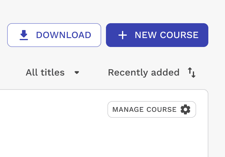
Multiple button types can be used to express different emphasis levels. When using buttons that are contextually connected to left-to-right content, the buttons should also be left aligned, with the most important action coming first. When the buttons are positioned as actions for a larger context, like an entire modal or page, then the buttons will typically be right aligned, with the most important action on the far right.
Correct
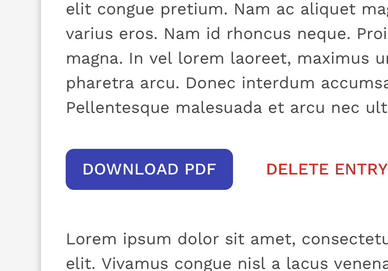
When using multiple buttons, you can place a text button next to a solid button to show emphasis.
Correct
When using multiple buttons in the bottom bar of a modal, the buttons align to the right with the most important button on the far right.
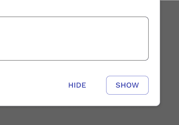
Correct
You can place a text button (low emphasis) next to an outlined button (medium emphasis).
Responsive Behavior
Button sizes and placements will sometimes need to change because of the size of the user’s screen. CSS breakpoints should be determined based on need, instead of limited to a set of standard breakpoints.
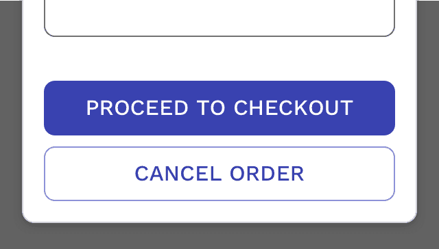
Correct
You may allow the buttons to go block level if it benefits the design or if there isn’t enough room for them to remain side-by-side.
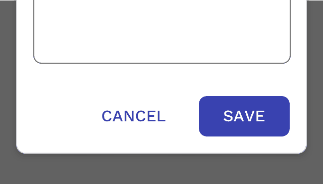
Correct
No need to force buttons to be block level if they fit in the container without problem.
On this page