Begin by identifying the objective of the visualization, and then choose the chart type that best fits the purpose.
Every chart type listed below is rendered in Chart Demos with the accessible Magma toolbar enabled, providing a "Show as table" data view, fullscreen toggle, and downloads (CSV, PNG, JPG). See Getting Started for the implementation details and accessibility rationale.
Comparisons
Comparison charts compare data between multiple distinct categories.
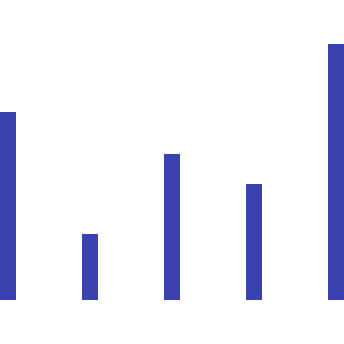
Simple Bar
Bar charts use vertical or horizontal markers to compare values, allowing for assessment of discrete data or trends over time.
View Demo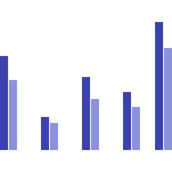
Grouped Bar
A grouped bar chart, also known as a clustered bar graph, multi-set bar chart, or grouped column chart, is used to compare values across multiple categories.
View Demo
Floating Bar
A floating bar chart uses horizontal bars to represent data, spanning between the minimum and maximum values, and floating freely rather than being anchored to an axis.
View Demo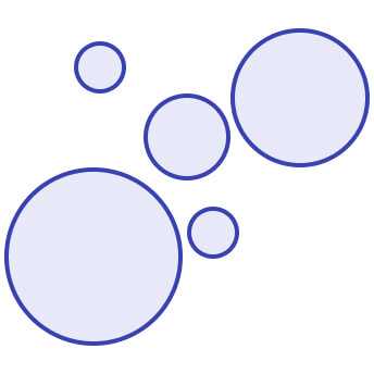
Bubble
A bubble chart, or bubble plot, uses bubbles to represent data points and their relationships in a two-dimensional plot.
View Demo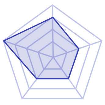
Radar
A radar chart, or spider chart, web chart, or star chart, is a two-dimensional graph displaying multiple quantitative variables in a single visual.
View Demo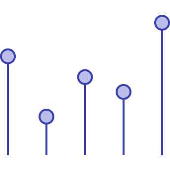
Lollipop
A lollipop chart is a variation of a bar chart ideal for highlighting individual data points or illustrating the relationship between numeric and categorical variables.
View Demo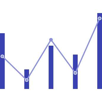
Combo
A Combo Chart is a data visualization that combines two or more chart types (e.g., bar and line charts) into a single graph.
View DemoTrends
Trend charts show data over a period of time, to reveal trends or make comparisons across multiple categories.
Line
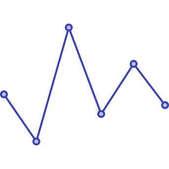
Line charts depict data at regular intervals, connecting points with lines. They are valuable for illustrating trends over time and comparing multiple datasets.
View Demo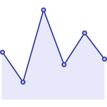
Area
Area charts share similarities with line charts, distinguished by the filled areas below the lines.
View Demo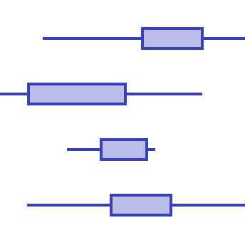
Boxplot
A boxplot, or box and whisker plot, summarizes a set of data, showing its distribution and any outliers.
View Demo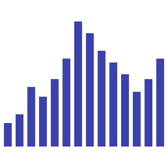
Histogram
A histogram is a statistical chart depicting the distribution of a continuous dataset using bars, with each bar representing a specific category or class interval.
View Demo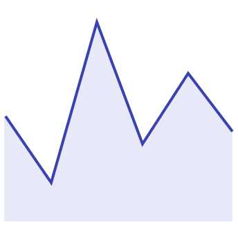
Sparkline
A Sparkline Chart is a small, simple chart that provides a compact visual representation of trends in data.
View Demo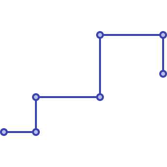
Step
A Step Chart is a type of line chart that displays data as a series of steps rather than a smooth trend.
View DemoPart-to-whole
Part-to-whole charts show how partial elements add up to a total.
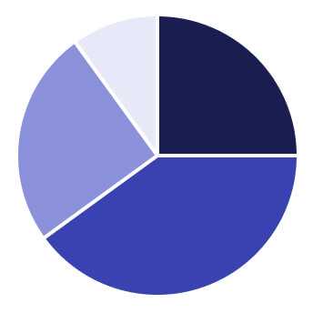
Pie
A pie chart visually summarizes nominal data or illustrates the distribution of values, such as percentage distribution.
View Demo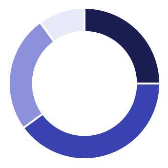
Donut
A donut chart is a type of pie chart with a hole in the middle. It shows the relationship of parts to a whole and the percentage each value contributes to the total.
View Demo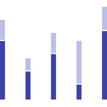
Stacked Bar
A stacked bar chart, also called a stacked bar graph or stacked column chart, compares multiple variables over time.
View Demo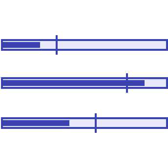
Bullet
Bullet charts are commonly used in dashboards to effectively compare metrics against target benchmarks or predefined ranges.
View Demo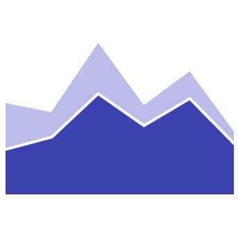
Stacked area
A stacked area chart is a graph that shows how the values of multiple groups change over time.
View Demo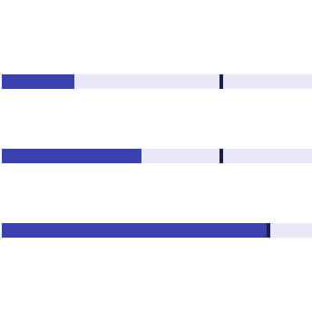
Meter
Meter charts are used to measure the rate of change of a quantity against pre-defined targets.
View Demo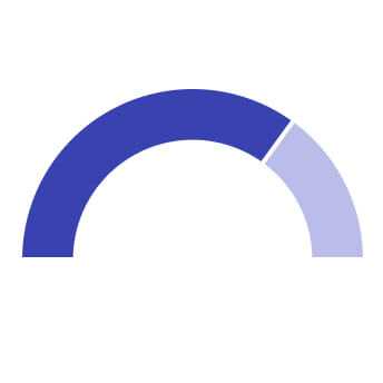
Gauge
A gauge chart, also known as a dial or speedometer chart, displays a single data value quantitatively.
View DemoCorrelations
Correlation charts show the relationship between two or more variables.
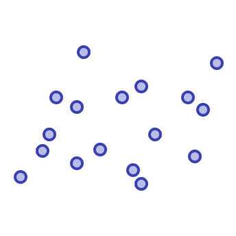
Scatter
Scatter plots use data points to plot two measures along a scale, allowing exploration of correlations between different variables.
View DemoOn this page