Get started on your project more quickly with these ready-made page templates.
Full-width Template
This template is ideal for applications that need as much of the screen as possible.

import React from 'react';import { Header } from '@cengage-patterns/header';import {Drawer,DrawerPosition,Grid,GridItem,GridJustifyContent,magma,useMediaQuery,} from 'react-magma-dom';export function Example() {const [showDrawer, setShowDrawer] = React.useState(false);const isSmallerScreen = useMediaQuery(`(max-width:${magma.breakpoints.small}px)`);return (<GridgridJustifyContent={GridJustifyContent.center}gridTemplateColumns={'repeat(4, 1fr)'}gridTemplateRows={'0.2fr 1.5fr 1.2fr 0.8fr'}gridGap="0.5em"><GridItem gridColumn="1 / 5"><HeaderisInverselogo={<strong>LOGO</strong>}breakpoint={magma.breakpoints.large}isCompact={isSmallerScreen}onMenuButtonClick={() => setShowDrawer(true)}/></GridItem><DraweronClose={() => setShowDrawer(false)}isOpen={showDrawer}position={DrawerPosition.left}>Content</Drawer><GridItemgridColumn="1 / 5"style={{backgroundColor: magma.colors.primary500,color: magma.colors.neutral100,textAlign: 'center',padding: magma.spaceScale.spacing05,width: 'calc(100% - 48px)',margin: '0 auto',}}>Main</GridItem><GridItemgridColumn={isSmallerScreen ? '1 / 5' : '1 / 3'}style={{backgroundColor: magma.colors.primary100,textAlign: 'center',padding: magma.spaceScale.spacing05,width: isSmallerScreen ? 'calc(100% - 48px)' : 'auto',margin: isSmallerScreen ? '0 auto' : '0 0 0 25px',}}>Content</GridItem><GridItemgridColumn={isSmallerScreen ? '1 / 5' : '3 / 4'}style={{backgroundColor: magma.colors.primary300,color: magma.colors.neutral100,textAlign: 'center',padding: magma.spaceScale.spacing05,width: isSmallerScreen ? 'calc(100% - 48px)' : 'auto',margin: isSmallerScreen ? '0 auto' : '0',}}>Content</GridItem><GridItemgridColumn={isSmallerScreen ? '1 / 5' : '4 /5'}style={{backgroundColor: magma.colors.primary400,color: magma.colors.neutral100,textAlign: 'center',padding: magma.spaceScale.spacing05,width: isSmallerScreen ? 'calc(100% - 48px)' : 'auto',margin: isSmallerScreen ? '0 auto' : '0 25px 0 0',}}>Content</GridItem><GridItemgridColumn="1 / 5"style={{backgroundColor: magma.colors.primary600,color: magma.colors.neutral100,textAlign: 'center',padding: magma.spaceScale.spacing05,width: 'calc(100% - 48px)',margin: '0 auto',}}>Footer</GridItem></Grid>);}
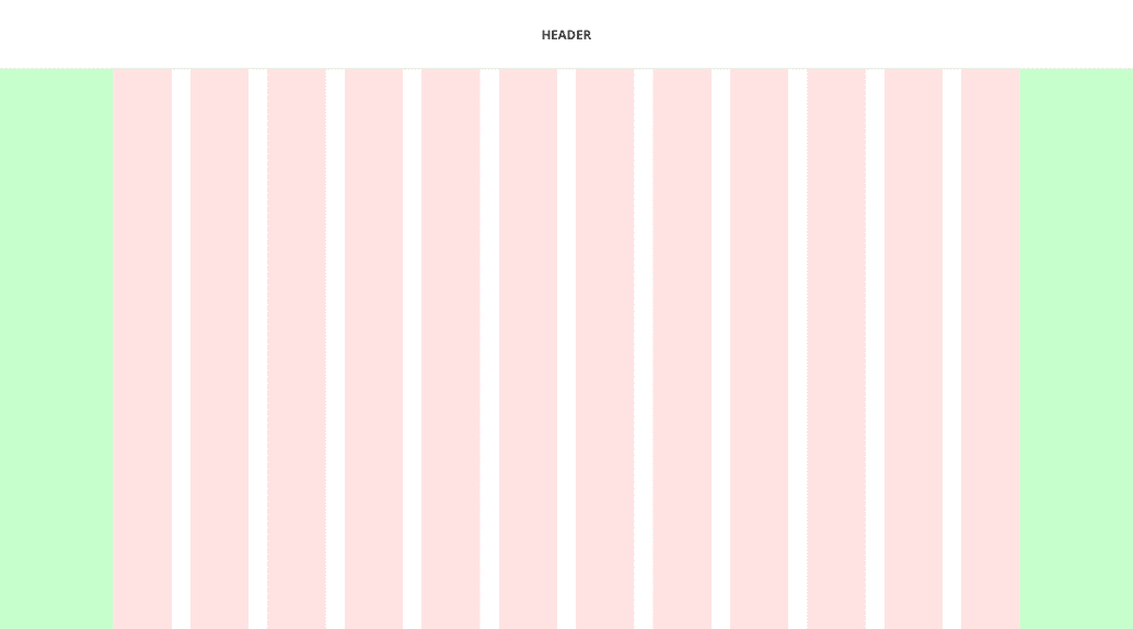
Restricted-width Template
This template is great for pages that focus more on reading content like marketing materials, articles, etc.
import React from 'react';import { Header } from '@cengage-patterns/header';import {Drawer,DrawerPosition,Grid,GridItem,magma,useMediaQuery,} from 'react-magma-dom';export function Example() {const [showDrawer, setShowDrawer] = React.useState(false);const isSmallerScreen = useMediaQuery(`(max-width:${magma.breakpoints.small}px)`);return (<GridgridTemplateColumns={'auto 1fr'}gridTemplateRows={'auto 1fr'}gridGap="1em"><GridItem gridColumn="1 / 3"><Headerlogo={<strong>LOGO</strong>}breakpoint={magma.breakpoints.large}isCompact={isSmallerScreen}onMenuButtonClick={() => setShowDrawer(true)}style={{backgroundColor: magma.colors.warning400,color: magma.colors.neutral100,}}/></GridItem><Drawerposition={DrawerPosition.left}onClose={() => setShowDrawer(false)}isOpen={showDrawer}>Sidebar</Drawer><GridItemgridColumn="1 / 3"style={{textAlign: 'center',backgroundColor: magma.colors.warning500,color: magma.colors.neutral100,width: 'calc(100% - 148px)',maxWidth: '952px',justifySelf: 'center',padding: magma.spaceScale.spacing05,height: 'calc(70vh - 122px)',}}>content</GridItem><GridItemgridColumn={isSmallerScreen ? '1 / 3' : '1 / 2'}style={{textAlign: 'center',backgroundColor: magma.colors.warning300,color: magma.colors.neutral100,padding: magma.spaceScale.spacing05,justifySelf: isSmallerScreen ? 'center' : 'stretch',width: isSmallerScreen ? 'calc(100% - 148px)' : 'auto',margin: isSmallerScreen ? '0 auto' : '0 0 0 75px',}}>article 1</GridItem><GridItemgridColumn={isSmallerScreen ? '1 / 3' : '2 / 3'}style={{textAlign: 'center',backgroundColor: magma.colors.warning300,color: magma.colors.neutral100,padding: magma.spaceScale.spacing05,justifySelf: isSmallerScreen ? 'center' : 'stretch',width: isSmallerScreen ? 'calc(100% - 148px)' : 'auto',margin: isSmallerScreen ? '0 auto' : '0 75px 0 0 ',}}>article 2</GridItem></Grid>);}
Global Header with Sidebar
This template includes a screen region for a left sidebar and includes all of the necessary responsive behavior.

import React from 'react';import { Header } from '@cengage-patterns/header';import {Drawer,DrawerPosition,Grid,GridItem,magma,useMediaQuery,} from 'react-magma-dom';export function Example() {const [openDrawer, setOpenDrawer] = React.useState(false);const isLargeScreen = useMediaQuery(`(max-width:${magma.breakpoints.large}px)`);const isSmallerScreen = useMediaQuery(`(max-width:${magma.breakpoints.small}px)`);return (<GridgridTemplateColumns={'auto 1fr'}gridTemplateRows={'auto 1fr'}gridTemplateAreas={('sidebar header header', 'sidebar content content')}gridGap={'0.25em'}>{isLargeScreen ? (<Drawer position={DrawerPosition.left} isOpen={openDrawer}><divstyle={{background: magma.colors.secondary700,padding: magma.spaceScale.spacing05,width: '240px',height: 'calc(100vh - 32px)',}}>Sidebar</div></Drawer>) : (<GridItemas={'sidebar'}gridColumn="1 / 2"gridRow="1 / 3"style={{ background: magma.colors.secondary700, width: '240px' }}>Sidebar</GridItem>)}<GridItem as={'header'} gridColumn="2 / 3"><HeaderisInverselogo={<strong>LOGO</strong>}breakpoint={magma.breakpoints.large}isCompact={isSmallerScreen}onMenuButtonClick={() => {setOpenDrawer(!openDrawer);}}/></GridItem><GridItemas="content"gridColumn="2 / 3"style={{maxWidth: '1600px',width: '100%',justifySelf: 'center',background: magma.colors.secondary500,padding: magma.spaceScale.spacing05,margin: '0 auto',height: 'calc(100vh - 122px)',}}>Content</GridItem></Grid>);}
Application Header with Sidebar
This template also includes the sidebar screen region, but the header extends all the way across the top of the page.

import React from 'react';import { Header } from '@cengage-patterns/header';import {Drawer,DrawerPosition,Grid,GridItem,magma,useMediaQuery,} from 'react-magma-dom';export function Example() {const [openDrawer, setOpenDrawer] = React.useState(false);const isLargeScreen = useMediaQuery(`(max-width:${magma.breakpoints.large}px)`);const isSmallerScreen = useMediaQuery(`(max-width:${magma.breakpoints.small}px)`);return (<GridgridJustifyContent={GridJustifyContent.center}gridTemplateColumns="auto 1fr"gridTemplateRows="auto 1fr"gridTemplateAreas={('header header', 'sidebar content', 'sidebar footer')}gridGap="2px"><GridItem as="header" gridColumn="1 / 4"><HeaderisInverselogo={<strong>LOGO</strong>}breakpoint={magma.breakpoints.large}isCompact={isSmallerScreen}onMenuButtonClick={() => {setOpenDrawer(!openDrawer);}}/></GridItem>{isLargeScreen ? (<Drawer position={DrawerPosition.left} isOpen={openDrawer}><divstyle={{background: magma.colors.primary200,padding: magma.spaceScale.spacing05,width: '240px',height: 'calc(100vh - 32px)',}}>Sidebar</div></Drawer>) : (<GridItemas="sidebar"gridColumn="1 / 2"gridRow="2 / 4"style={{width: '240px',background: magma.colors.primary200,padding: magma.spaceScale.spacing05,height: 'calc(100vh - 95px)',}}>Sidebar</GridItem>)}<GridItemas="content"gridColumn="2 / 4"gridRow="2"style={{maxWidth: '1600px',width: '100%',justifySelf: 'center',background: magma.colors.primary500,color: magma.colors.neutral100,padding: magma.spaceScale.spacing05,height: 'calc(100vh - 122px)',}}>Content</GridItem><GridItemas="footer"gridColumn="2 / 4"gridRow="3"style={{maxWidth: '1600px',width: '100%',justifySelf: 'center',background: magma.colors.primary700,color: magma.colors.neutral100,padding: magma.spaceScale.spacing05,height: '10vh',}}>Footer</GridItem></Grid>);}
On this page